Tour
Overview
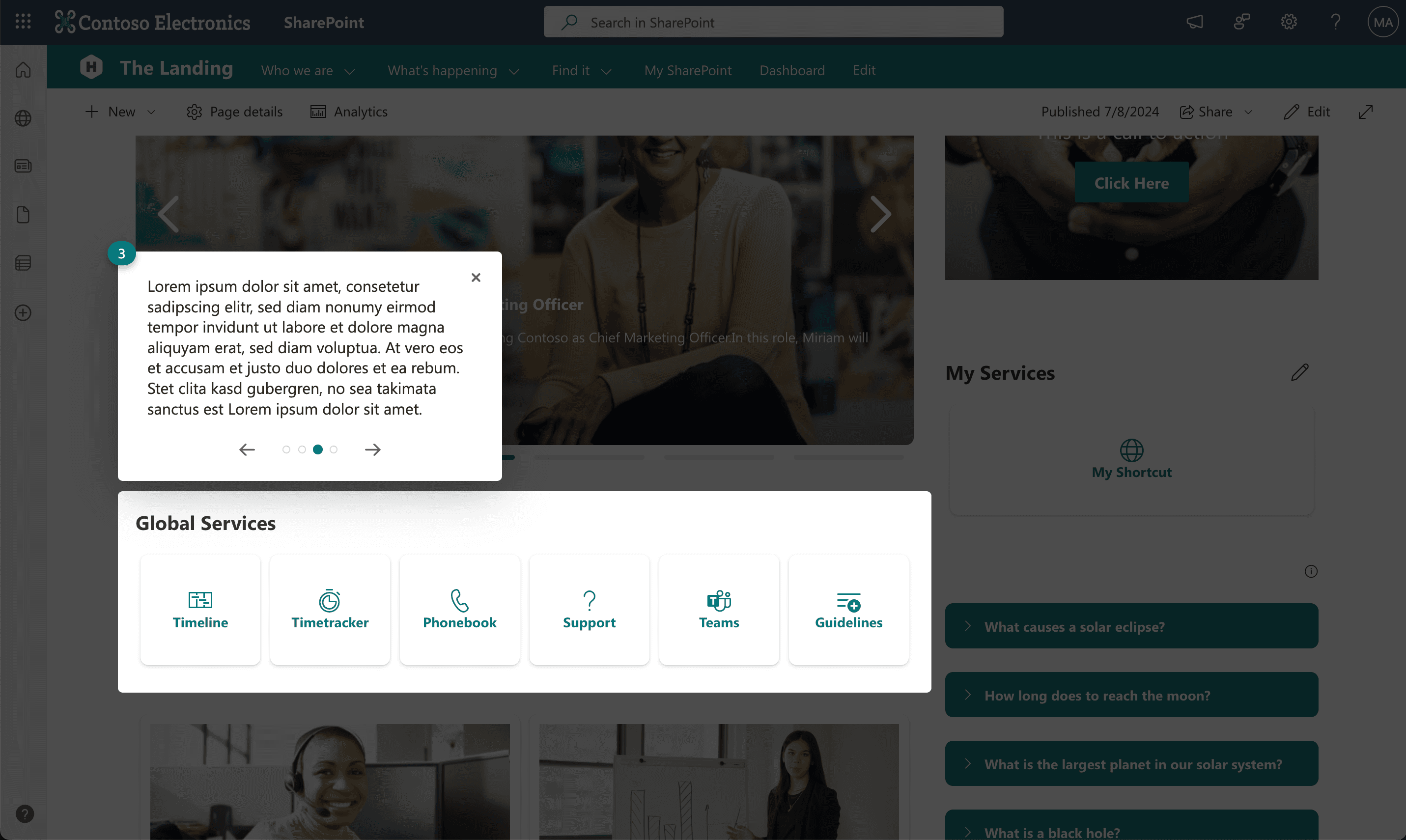
The Tour web part allows users to add an interactive tour as a guideline or page explanation. It is primarily used for onboarding scenarios or as a help assistant. The Tour web part targets any web part on a page and provides additional information. When configured, a "?" icon appears in the bottom left corner of the page. When a user clicks this icon, an interactive tour through each configured web part's information starts.
Features
- Interactive Tour: Guides users through different web parts on a page with additional information.
- Onboarding and Assistance: Ideal for onboarding scenarios or providing help and guidelines.
- Target Any Web Part: Allows targeting of any web part within the SharePoint page content area.
- "?" Icon: Displays a "?" icon in the bottom left corner of the page to start the tour.
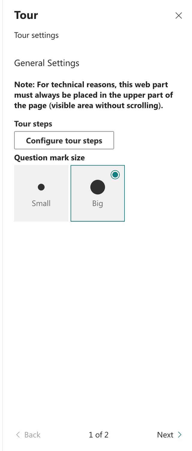
- Theming Options: Customize colors and themes on the second configuration page.
Configuration
Adding the Web Part to a Page
- Navigate to the page where you want to add the Tour web part.
- Click on "Edit" mode.
- Click on the "+" Symbol to open the webpart dialog.
- Select "Tour" from the list (Note the tour webpart has to be placed on top of the page because of loading restriction with).
- Configure the web part settings as needed.
- Save and publish the page.
Note: Ensure the Tour web part is always placed in the top area of the site to appear on page load.
Configure the Web Part
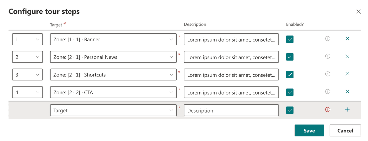
- Configure: Select the "?" size and choose "Configure tour steps for configuration.
- Target Web Parts: Select a webpart from the dropdown list.
- Add Information: Enter the additional information for each targeted web part.
-
Start Type:
- Immediate: The tour starts automatically when the user loads the page. You can choose to show the tour only once or every time a user visits the site. Note: The "show once" option is stored locally in the user's browser (Local Storage). If the user clears this storage or accesses the page from a different device, the tour will be shown again.
- Button: The tour starts only when the user clicks a designated button. Customize this button with standard or primary styles, and optionally enable Modern+ to round the button’s borders.
-
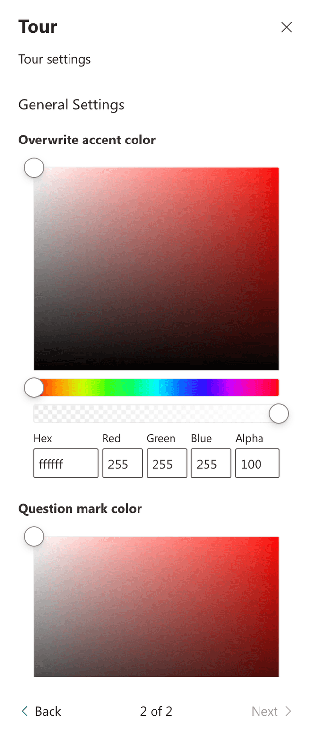
Theming Options: Navigate to the second configuration page to customize colors and themes.
Practical Use Cases
- Use Case 1: Use the Tour web part to create an interactive onboarding guide for new employees, explaining the key features and functionalities of your SharePoint site.
- Use Case 2: Implement a help tour on complex pages to provide users with step-by-step instructions on how to use different web parts and navigate the page effectively.
FAQ
Question 1
Q: Are there any restrictions on what can be targeted with the Tour web part?
A: Yes, it is not possible to target controls outside the SharePoint page content area such as navigation, site header, or footer. Additionally, due to lazy loading, the Tour web part must be placed in the top area of the site for the "?" icon to appear on page load.
Question 2
Q: What does the Tour web part do?
A: The Tour web part allows users to add an interactive tour to a SharePoint page, guiding them through different web parts with additional information. It is useful for onboarding scenarios or providing help and guidelines.
Question 3
Q: How do I customize the Tour web part?
A: You can customize the Tour web part by selecting the web parts to include in the tour, adding additional information for each targeted web part, ensuring the web part is placed in the top area of the site, and adjusting colors and themes on the second configuration page.