Tooltip
Overview
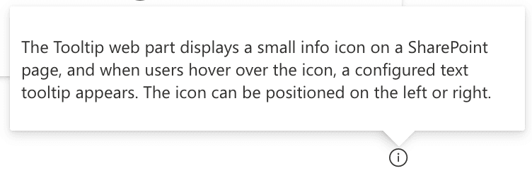
The Tooltip web part is a simple tool to display tooltips inside a SharePoint online intranet page. It displays a small info icon, and on hover, a configured text tooltip will appear. The position of the icon can be set to either the left or right.
Features
- Tooltip Display: Shows a tooltip text when hovering over the info icon.
- Icon Positioning: Configure the icon position to either left or right.
Configuration
Adding the Web Part to a Page
- Navigate to the page where you want to add the Tooltip web part.
- Click on "Edit" mode.
- Click on the "+" Symbol to open the webpart dialog
- Select "Tooltip" from the list.
- Configure the web part settings as needed.
- Save and publish the page.
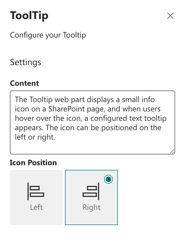
Configure the Web Part
- Tooltip Text: Enter the text that will be displayed when hovering over the info icon.
- Icon Position: Choose the position of the info icon (left or right).
Practical Use Cases
- Use Case 1: Use the Tooltip web part to provide additional information or context for certain elements on a page without cluttering the layout.
- Use Case 2: Implement tooltips to offer quick help or guidelines for users interacting with specific sections of a SharePoint page.
FAQ
Question 1
Q: What does the Tooltip web part do?
A: The Tooltip web part displays a small info icon on a SharePoint page, and when users hover over the icon, a configured text tooltip appears. The icon can be positioned on the left or right.
Question 2
Q: How do I customize the Tooltip web part?
A: You can customize the Tooltip web part by entering the desired tooltip text, selecting the icon position (left or right), and adjusting colors and themes on the second configuration page.