Dialog Web Part
Overview
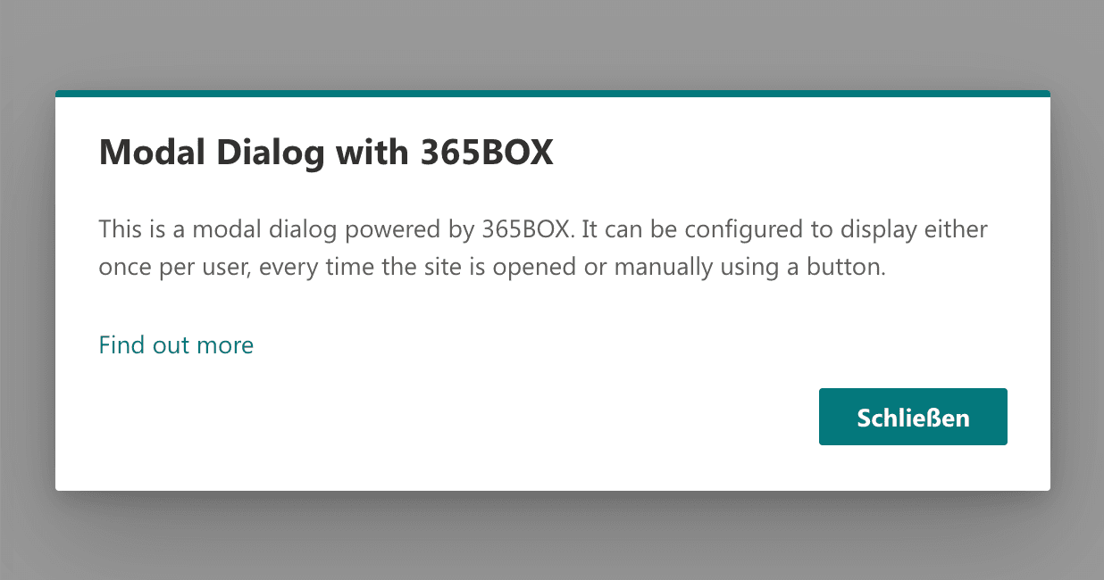
The "Dialog" webpart allows you to display modal dialogs (pop-ups) inside a SharePoint page. This webpart is perfect for grabbing attention, providing important announcements, or guiding users with additional information in a non-intrusive way.
Features
- Title and Text: Add a custom title and message for the dialog.
- Optional Link: Include a link for further action or details.
- Start Type Options:
- Immediate: Displays the dialog when the user loads the page.
- Button: Only shows the dialog when the user clicks a button.
- Show Once or Every Time: For "Immediate" start type, configure the dialog to show just once or every time the page is visited.
- Button Display Configurations:
- Standard: Regular button appearance.
- Primary: Highlighted button with a primary theme color.
- Modern+ Switch: Option to round the button's borders for a modern look.
Note: The "Show once" setting is stored in the local storage of the user's device. If the user accesses the page from a different device or clears their local storage, the dialog will be displayed again.
Configuration
Adding the Web Part to a Page
- Navigate to the SharePoint page where you want to add the web part.
- Click on "Edit" mode.
- Click on the "+" Symbol to open the webpart dialog
- Select Dialog from the list.
- Configure the dialog settings as needed.
- Save and publish the page.
Configuring the Web Part
- Title: Enter the title of the dialog.
- Text: Add the content text that will be displayed in the dialog.
- Link: Optionally, you can add a link with a custom caption to direct users to more information.
- Start Type:
- Immediate: The dialog appears automatically when the user loads the page. You can choose to show the dialog only once or every time a user visits the site.
- Note: The "show once" option is saved locally in the user's browser (Local Storage). If the user clears this storage or accesses the page from a different device, the dialog will be shown again.
- Button: The dialog appears only when the user clicks a button. You can configure the button in two styles:
- Standard: A regular button.
- Primary: A button with a primary color to draw more attention.
- Immediate: The dialog appears automatically when the user loads the page. You can choose to show the dialog only once or every time a user visits the site.
- Modern+ Switch: Option to enable rounded borders for the button, giving it a modern look.
Practical Use Cases
- Use Case 1: Announcing upcoming events or important updates immediately when users load the SharePoint page.
- Use Case 2: Netiquette.
- Use Case 2: Offering additional information or resources behind a button, allowing users to view the dialog at their discretion.
FAQ
Question 1
Q: Can I control how often the dialog appears?
A: Yes, when using the "Immediate" start type, you can configure the dialog to appear every time the user visits the page or only once. However, the "once" option is stored locally in the user's browser (via Local Storage), so if the user clears this storage or uses a different device, the dialog will appear again.
Question 2
Q: Can I customize the look of the button?
A: Yes, you can choose between a Standard button or a Primary button (which applies a themed color). Additionally, with the Modern+ switch, you can round the borders of the button to give it a modern appearance.